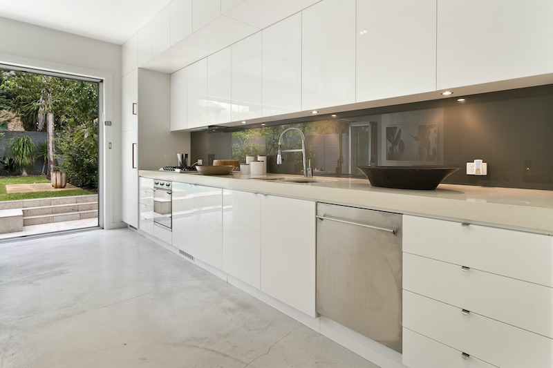
Kitchen glass splashbacks are chosen for their clean look, easy maintenance, and ability to transform a space with colour. When you want a precise shade that matches cabinets, walls, or accessories, RAL matching becomes the key step.
At the same time, colour accuracy can be affected by lighting, backing paint, and even how you view a sample. A little planning with samples and expectations helps you avoid costly surprises once the glass is installed.
How RAL matching works in real kitchens
When selecting kitchen glass splashbacks, RAL matching is a way to specify a standardised colour rather than guessing by eye. You choose a RAL code, and the supplier mixes or selects a paint that targets that exact reference.
This is especially useful if you need the splashback to match a particular cabinet colour, feature wall, or branded tone. It also makes repeat orders easier if you later add more panels or extend the kitchen.
However, a RAL code is not a guarantee that every material in the room will look identical. Paint on glass can appear different from paint on a wall because glass reflects light and has a smooth, glossy surface.
Also consider that RAL charts are printed references, and printed colour can vary slightly between manufacturers and batches. The safest route is to treat the RAL code as a starting point, then confirm with a physical sample produced in the same method as your final panel.
Samples, lighting, and why they change everything

Samples are the most reliable way to judge colour before you commit. A small swatch lets you see how the shade behaves beside your worktop, tiles, and cabinet finish.
Check the sample in daylight, then check it again at night with your kitchen lights on. Warm LEDs can soften whites and push neutrals toward cream, while cool LEDs can make greys feel bluer.
Place the sample vertically where the splashback will sit, not flat on a worktop. Vertical viewing reveals reflections and glare that can make a colour feel brighter or darker than expected.
If your kitchen has strong under cabinet lighting, test directly under that light strip. Glossy glass can increase contrast, which may make bold colours look richer and pale colours look crisper.
Ask whether the colour is painted on the back of clear glass or applied behind low iron glass. Low iron glass reduces green tint, which can improve accuracy for whites and pale tones.
Accuracy details that affect the final fit and finish

Colour accuracy is only one part of getting a premium result. Measurement accuracy matters just as much, especially around sockets, corners, and uneven walls.
Make sure the supplier confirms whether they need exact measurements or a template. Even small errors can create visible gaps, misaligned cutouts, or awkward joins that draw attention away from the colour.
Ask how cutouts are sized relative to faceplates. It is normal to allow a little clearance so the panel can be fitted without stress, then the socket cover hides the edge.
Also confirm the finish level, such as polished edges, rounded corners, and the type of sealant used at the worktop line. These details influence both safety and how refined the splashback looks up close.
Finally, verify the order paperwork, including RAL code, glass type, finish, and panel layout. A clear sign off reduces the risk of a correct colour being delivered in the wrong sheen or on the wrong glass base.
Conclusion
Kitchen glass splashbacks can match a precise RAL shade beautifully when you combine the code with real samples and realistic lighting checks. Treat the RAL number as the reference, then trust the sample in your own kitchen conditions.
By paying attention to glass type, finish, and measurement accuracy, you protect both the look and the fit. The result is a colour that feels intentional, consistent, and right for the space every day.